
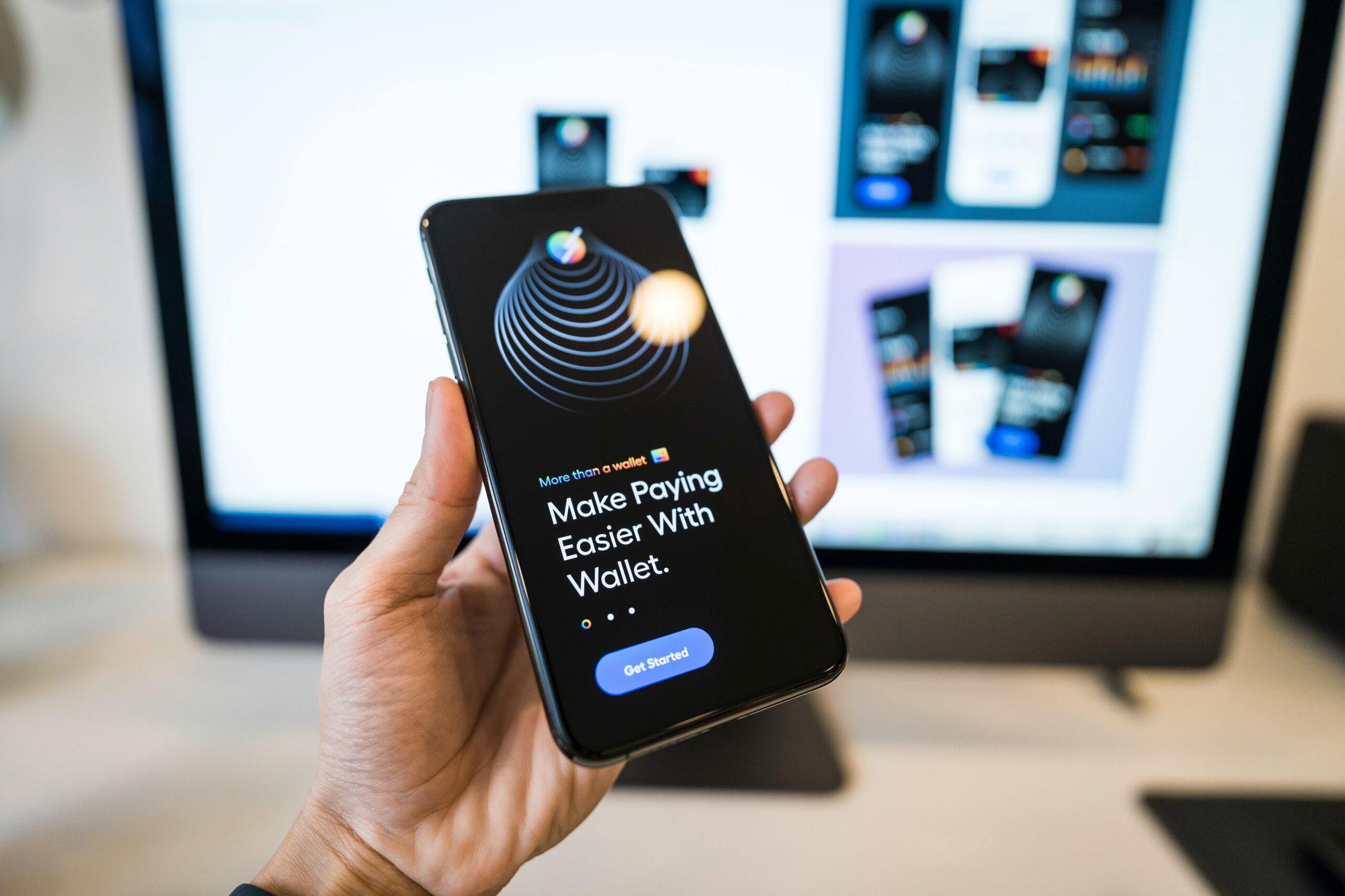
The Importance of Mobile-Friendly Website Design
In today’s digital-first world, having a website is no longer enough. Businesses need a website that works seamlessly across smartphones, tablets, laptops, and desktop computers. With the majority of internet users accessing websites through mobile devices, mobile-friendly website design has become an essential part of a successful digital strategy.
A mobile-friendly website is designed to automatically adapt to different screen sizes and provide visitors with a smooth, convenient, and engaging browsing experience. From easy navigation and readable content to fast loading speeds and mobile-friendly forms, every element should be optimized for users who may be accessing the website from a smartphone.
For businesses, this is particularly important because a poor mobile experience can result in visitors leaving the website, reduced engagement, fewer leads, lower sales, and a weaker online reputation. On the other hand, a well-designed mobile website can improve user satisfaction, strengthen brand credibility, support search engine visibility, and increase conversions.
This comprehensive guide explains why mobile-friendly website design matters, how it affects user experience and SEO, the key features of a mobile-friendly website, common mistakes to avoid, and how businesses can create a website that performs effectively across all devices.
What Is a Mobile-Friendly Website?
A mobile-friendly website is a website that has been designed and developed to provide an excellent user experience on smartphones and other mobile devices.
Traditional desktop websites often use large layouts that can be difficult to view on smaller screens. Users may have to zoom in, scroll horizontally, or repeatedly adjust the screen to read content and interact with buttons. A mobile-friendly website eliminates these problems by adapting its layout and functionality to the device being used.
Responsive web design is one of the most common approaches to achieving this. With responsive design, the website automatically adjusts elements such as images, text, navigation menus, columns, buttons, and forms according to the user’s screen size.
For example, a three-column desktop layout may automatically become a single-column layout on a smartphone. Navigation links may transform into a compact menu, while images resize to fit the available screen width.
The goal is simple: the website should be easy to use regardless of the device.
Why Mobile-Friendly Website Design Is Important
Mobile-friendly design affects almost every aspect of a website’s performance. It influences how users interact with a business, how search engines understand and rank its pages, and how effectively the website generates leads and sales.
Here are some of the most important reasons businesses should prioritize mobile-friendly design.
1. More People Browse the Internet on Mobile Devices
Smartphones have become one of the primary ways people access the internet. Users search for businesses, compare products, read reviews, watch videos, make purchases, communicate with companies, and consume content directly from their phones.
This means your website may often be the first interaction a potential customer has with your business.
Imagine a potential customer searches for your service while travelling or during a lunch break. They click your website, but the page is difficult to navigate, the text is too small, the buttons are difficult to tap, and the page takes too long to load.
There is a strong possibility that the visitor will leave and choose a competitor instead.
A mobile-friendly website ensures that your business is ready whenever potential customers discover you through their smartphones.
2. It Improves User Experience
User experience is one of the most important factors in modern website design.
Visitors expect websites to be simple, fast, accessible, and intuitive. They should be able to find information without unnecessary effort.
A mobile-friendly website improves the user experience by providing:
- Easy-to-read text
- Simple navigation
- Properly sized buttons
- Responsive images
- Fast-loading pages
- Easy-to-complete forms
- Logical content structure
- Mobile-friendly menus
- Minimal unnecessary scrolling
- Proper spacing between clickable elements
When users can easily accomplish what they came to do, they are more likely to stay on the website and explore additional pages.
Good user experience can ultimately lead to more enquiries, registrations, purchases, calls, and other valuable actions.
3. Mobile-Friendly Design Supports SEO
Search engine optimization is another major reason mobile-friendly design matters.
Search engines aim to provide users with useful and accessible results. If a website provides a poor experience on mobile devices, it can negatively affect its overall search performance.
Google has adopted mobile-first indexing, meaning Google primarily uses the mobile version of a website’s content for indexing and ranking. This makes mobile optimization an important technical and SEO consideration.
A responsive website helps ensure that mobile and desktop visitors can access the same essential content while the layout adapts to their screen.
However, mobile-friendliness is not simply about satisfying a search engine. Search visibility depends on many factors, including content quality, relevance, technical performance, page experience, authority, and search intent.
Mobile optimization should therefore be considered an important component of a broader SEO strategy rather than a standalone ranking tactic.
4. It Reduces Bounce Rates
A visitor may leave a website quickly if they encounter usability problems.
Common mobile problems include:
- Tiny text
- Broken layouts
- Slow loading
- Pop-ups covering the screen
- Difficult navigation
- Unresponsive buttons
- Horizontal scrolling
- Poorly designed forms
- Intrusive advertisements
When users encounter these problems, they may abandon the website before viewing its products or services.
A responsive and well-optimized design removes many of these barriers.
The easier a website is to use, the more likely visitors are to continue browsing.
Lower abandonment can contribute to better engagement and give businesses more opportunities to convert visitors into customers.
5. It Builds Brand Credibility
Your website is often a digital representation of your brand.
Users frequently judge a business based on the quality of its online presence. A modern, responsive, professional website can create a positive first impression.
Conversely, a website that looks outdated or broken on a smartphone can make a company appear less professional.
For example, consider two businesses offering similar services. One has a clean, fast, mobile-friendly website with clear information and easy contact options. The other has a website that requires zooming and horizontal scrolling.
Even if both businesses offer excellent services, the first business may appear more trustworthy to a new customer.
Mobile-friendly design therefore contributes to perceived professionalism and credibility.
6. It Increases Lead Generation
For service-based businesses, the primary purpose of a website is often to generate enquiries and leads.
A visitor may want to:
- Call the business
- Submit an enquiry
- Request a quotation
- Book an appointment
- Send a WhatsApp message
- Download a brochure
- Register for a service
- Request a consultation
These actions need to be simple on mobile devices.
A mobile-friendly website can place important calls to action where users can easily see and tap them.
Buttons such as “Call Now,” “Get a Quote,” “Contact Us,” or “Request a Consultation” should be appropriately sized and easy to access.
A complicated mobile form with too many fields can discourage users. Mobile-friendly lead generation forms should request only the information that is genuinely necessary.
7. It Supports E-Commerce Sales
Mobile optimization is especially important for online stores.
Consumers increasingly research products, compare prices, read reviews, and purchase products through smartphones.
An e-commerce website must make the entire customer journey easy:
Product discovery → Product information → Add to cart → Checkout → Payment → Confirmation
Every step should work smoothly on smaller screens.
Product images should display properly, descriptions should remain readable, filters should be easy to use, and checkout forms should be simple.
A poor mobile checkout experience can result in abandoned carts.
For e-commerce businesses, mobile-friendly design is therefore directly connected to revenue opportunities.
8. It Improves Website Loading Experience
Mobile users may browse websites using cellular networks or less reliable connections. This makes website performance particularly important.
Large images, unnecessary scripts, excessive animations, poorly optimized code, and third-party resources can slow down a website.
A mobile-friendly website should be optimized for performance.
Important techniques include:
- Compressing images
- Using modern image formats where appropriate
- Minimizing unnecessary scripts
- Optimizing CSS and JavaScript
- Using browser caching
- Reducing server response time
- Implementing efficient content delivery
- Lazy-loading appropriate media
- Removing unnecessary plugins
- Optimizing fonts
Performance should be measured using real-world data and tools such as Google’s Core Web Vitals reports.
A fast website provides a better experience and can improve the overall effectiveness of digital marketing campaigns.
9. It Makes Navigation Easier
Navigation is one of the biggest challenges when converting a desktop website to mobile.
Desktop websites have plenty of horizontal space for navigation menus. Smartphones do not.
Mobile-friendly websites typically use compact navigation patterns such as hamburger menus, expandable menus, or simplified navigation systems.
The goal should be to help visitors find important pages quickly.
For example, a business website might prioritize:
- Home
- About
- Services
- Products
- Portfolio
- Blog
- Contact
The navigation should not overwhelm users with dozens of links.
A well-planned mobile information architecture allows users to reach important content with minimal effort.
10. It Improves Accessibility
Mobile-friendly design can also contribute to better accessibility.
Websites should be designed so that users with different abilities can interact with them effectively.
Important considerations include:
- Adequate text size
- Sufficient contrast
- Clear labels
- Keyboard accessibility where relevant
- Descriptive link text
- Accessible forms
- Proper heading structure
- Alternative text for meaningful images
- Logical page structure
Accessibility is not simply a technical requirement. It reflects good digital design principles and helps create websites that work for a broader audience.
11. It Supports Local Search
Mobile devices play an important role in local searches.
People frequently search for businesses, restaurants, offices, hospitals, shops, services, and other nearby locations while using smartphones.
A mobile-friendly website makes it easier for users to:
- Find the business address
- Call the business
- View opening hours
- Request directions
- Explore services
- Read important information
- Submit an enquiry
For local businesses, mobile optimization should be combined with a strong local SEO strategy, accurate business information, and an optimized Google Business Profile.
12. It Creates a Consistent Brand Experience
Customers may interact with your business through multiple devices.
They might discover your company on a smartphone, research it on a laptop, and eventually make a purchase using a tablet.
A responsive website helps maintain consistency across these devices.
Brand elements such as:
- Logo
- Typography
- Colors
- Images
- Messaging
- Navigation
- Calls to action
should maintain a consistent identity.
Consistency helps users recognize your brand and creates a more professional experience.
13. It Makes Digital Advertising More Effective
Businesses invest significant amounts of money in Google Ads, social media advertising, display advertising, influencer campaigns, and other digital marketing activities.
But getting someone to click an advertisement is only part of the process.
After clicking an ad, the user reaches a landing page or website. If that page is difficult to use on a smartphone, the advertising investment may not produce the expected results.
A mobile-friendly landing page can help visitors quickly understand:
- What the company offers
- Why the product or service matters
- What action they should take
- How to contact the business
This creates a stronger connection between advertising and conversion.
14. It Helps Improve Conversion Rates
Website traffic is valuable, but traffic alone does not generate revenue.
Businesses ultimately want visitors to take meaningful actions.
These actions can include:
- Making a purchase
- Calling
- Filling out a form
- Booking a service
- Requesting information
- Downloading a resource
- Signing up for a newsletter
Mobile-friendly design removes unnecessary friction from these conversion processes.
For example, a mobile visitor should not have to pinch and zoom to click a “Submit” button.
Small design improvements can make the customer journey significantly smoother.
Essential Features of a Mobile-Friendly Website
A genuinely mobile-friendly website should include several important characteristics.
Responsive Layout
The layout should automatically adapt to different screen sizes.
Readable Typography
Text should be comfortably readable without requiring users to zoom.
Touch-Friendly Buttons
Interactive elements should provide enough space for users to tap accurately.
Fast Loading
Pages should load quickly and avoid unnecessary resources.
Mobile-Friendly Navigation
Menus should be simple, clear, and easy to operate.
Optimized Images
Images should maintain quality without unnecessarily increasing page weight.
Easy Forms
Forms should be short, clearly labeled, and simple to complete.
Clear Calls to Action
Users should immediately understand the next step.
Avoidance of Horizontal Scrolling
Users should generally be able to browse vertically without needing to move the page sideways.
Accessible Design
Content and functionality should be usable by as many people as reasonably possible.
Mobile-Friendly vs Mobile-First Design
These two terms are often confused.
A mobile-friendly website is designed to work effectively on mobile devices.
A mobile-first website takes the concept further by beginning the design process with the smallest screen and then progressively enhancing the experience for larger screens.
Mobile-first design encourages designers and developers to prioritize the most important content and functionality.
This can lead to cleaner layouts and better performance because unnecessary elements are identified early.
For many modern websites, a mobile-first approach can be an effective design philosophy.
Common Mobile Website Design Mistakes
Even businesses that have responsive websites can make mobile usability mistakes.
1. Using Tiny Text
If users need to zoom in to read content, the design needs improvement.
2. Overcrowding the Screen
Trying to fit every desktop element onto a smartphone creates a confusing interface.
3. Using Oversized Pop-Ups
Pop-ups that cover most of the mobile screen can interrupt the user experience.
4. Making Buttons Too Small
Small clickable elements are difficult to tap accurately.
5. Ignoring Page Speed
A responsive design is not automatically a fast design.
6. Using Large Unoptimized Images
High-resolution images can significantly increase page loading time.
7. Complicated Forms
Long forms discourage mobile users from completing enquiries.
8. Poor Navigation
Visitors should not have to search extensively for essential information.
9. Horizontal Scrolling
Most standard website content should fit within the device’s viewport.
10. Testing Only on One Smartphone
Different devices have different screen sizes, browsers, and operating systems.
A website should be tested across multiple device sizes and browsers.
How to Make a Website Mobile-Friendly
Businesses can follow a systematic process to improve mobile usability.
Step 1: Use Responsive Web Design
Build the website using responsive layouts that automatically adapt to screen size.
Step 2: Simplify the Interface
Remove unnecessary design elements and prioritize important information.
Step 3: Optimize Images
Compress images and serve appropriately sized files.
Step 4: Improve Performance
Review scripts, plugins, fonts, hosting, caching, and other technical elements.
Step 5: Improve Navigation
Make important pages easy to find.
Step 6: Optimize Forms
Reduce unnecessary fields and make input controls mobile-friendly.
Step 7: Strengthen Calls to Action
Make important actions prominent and easy to complete.
Step 8: Test Across Devices
Test the website on smartphones, tablets, laptops, and desktops.
Step 9: Monitor Performance
Use analytics and performance tools to identify problems.
Step 10: Continuously Improve
Mobile optimization is not a one-time project. Websites should evolve as technology, user behavior, and business requirements change.
The Role of Core Web Vitals
Website performance is an important part of modern web development.
Google’s Core Web Vitals focus on user-centric aspects of loading performance, responsiveness, and visual stability.
The primary metrics include:
- Largest Contentful Paint (LCP)
- Interaction to Next Paint (INP)
- Cumulative Layout Shift (CLS)
Businesses should monitor these metrics and work with developers to improve areas where performance is weak.
However, achieving excellent Core Web Vitals alone does not guarantee high search rankings. Search performance depends on a broader set of factors.
Mobile-Friendly Design and Customer Trust
Trust is especially important when customers are considering purchasing a product or service online.
A professional mobile experience communicates that the business pays attention to detail.
Consider a customer looking for a professional service. If the website is modern, fast, informative, secure, and easy to navigate, the business may appear more established and trustworthy.
A poor website can have the opposite effect.
This is why website design should not be treated merely as decoration. It is an important part of the overall customer experience.
Mobile-Friendly Design for Different Industries
Mobile optimization benefits almost every industry.
Real Estate
Property buyers can browse listings, view images, download brochures, request site visits, and contact sales teams through mobile devices.
Healthcare
Patients can find doctors, view services, locate hospitals, and request appointments.
E-Commerce
Customers can discover products, compare options, and complete purchases.
Travel
Travelers can explore destinations, compare packages, and make enquiries while on the move.
Education
Students can explore courses, submit enquiries, and access learning resources.
Restaurants
Customers can view menus, find locations, make reservations, and contact restaurants.
Professional Services
Law firms, consultants, accountants, agencies, and other service providers can generate leads through mobile-friendly enquiry systems.
Regardless of industry, mobile optimization helps businesses meet customers where they already spend significant time: on their mobile devices.
How to Measure Mobile Website Performance
After launching or optimizing a mobile website, businesses should monitor its performance.
Important metrics include:
- Mobile traffic
- Engagement
- Conversion rate
- Form submissions
- Phone calls
- E-commerce transactions
- Page speed
- Core Web Vitals
- Landing page performance
- User flow
- Exit rates
Analytics data can reveal where mobile users are struggling.
For example, if thousands of users visit a landing page but very few complete the enquiry form, the form or overall page experience may need improvement.
Data-driven optimization is generally more effective than making design decisions based purely on assumptions.
Mobile-Friendly Website Design Is an Investment
Some businesses view website development as a one-time expense.
A better approach is to consider a website an ongoing digital business asset.
Your website can work around the clock to:
- Generate leads
- Sell products
- Provide information
- Build credibility
- Support marketing campaigns
- Answer customer questions
- Strengthen your brand
- Support customer service
If the website does not work effectively on mobile devices, a significant part of its potential can be lost.
Investing in responsive design, performance optimization, accessibility, security, content, and ongoing maintenance can therefore produce long-term business value.
The Future of Mobile Web Design
Mobile web design will continue to evolve as smartphones, browsers, connectivity, artificial intelligence, and user expectations develop.
Modern websites are increasingly expected to be:
- Fast
- Responsive
- Accessible
- Secure
- Personalized
- Easy to navigate
- Visually engaging
- Performance-focused
Businesses should avoid designing websites only for today’s devices. Instead, they should adopt flexible design and development practices that can adapt to future technologies and screen sizes.
The underlying principle will remain the same: make digital experiences easy and useful for the customer.
Conclusion
Mobile-friendly website design is no longer an optional feature for modern businesses. It is a fundamental requirement for creating a successful online presence.
From improving user experience and supporting SEO to increasing leads, strengthening brand credibility, supporting e-commerce sales, and improving advertising performance, mobile optimization can influence almost every stage of the digital customer journey.
A successful mobile website should load quickly, display content clearly, provide intuitive navigation, offer touch-friendly interactions, simplify forms, and make important actions easy to complete.
Businesses should also remember that mobile optimization is not simply about shrinking a desktop website to fit a smartphone. It requires thoughtful design, responsive development, performance optimization, accessibility, testing, and continuous improvement.
As consumers continue to rely heavily on smartphones for information, communication, shopping, and business interactions, companies that prioritize mobile experiences will be better positioned to compete in the digital marketplace.
Your website is often the first interaction a customer has with your brand. Make sure that first interaction works perfectly—regardless of the device they use.